You can not select more than 25 topics
Topics must start with a letter or number, can include dashes ('-') and can be up to 35 characters long.
 837816638@qq.com
b02b851162
837816638@qq.com
b02b851162
|
5 years ago | |
|---|---|---|
| .. | ||
| dist | 5 years ago | |
| src | 5 years ago | |
| .flowconfig | 5 years ago | |
| HISTORY.md | 5 years ago | |
| LICENSE | 5 years ago | |
| README.md | 5 years ago | |
| index.d.ts | 5 years ago | |
| package.json | 5 years ago | |
| yarn.lock | 5 years ago | |
README.md
react-native-swipeout
iOS-style swipeout buttons that appear from behind a component
Installation
npm install --save react-native-swipeout
Usage example
See example/index.ios.js for a more detailed example. See the Wiki usage tips. To use swipeout behind a iOS-style listitem, try react-native-listitem.
import Swipeout from 'react-native-swipeout';
// Buttons
var swipeoutBtns = [
{
text: 'Button'
}
]
// Swipeout component
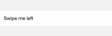
<Swipeout right={swipeoutBtns}>
<View>
<Text>Swipe me left</Text>
</View>
</Swipeout>
Props
| Prop | Type | Optional | Default | Description |
|---|---|---|---|---|
| autoClose | bool | Yes | false | auto close on button press |
| backgroundColor | string | Yes | '#dbddde' | |
| close | bool | Yes | close swipeout | |
| disabled | bool | Yes | false | whether to disable the swipeout |
| left | array | Yes | [] | swipeout buttons on left |
| onOpen | func | Yes | (sectionID, rowId, direction: string) => void | |
| onClose | func | Yes | (sectionID, rowId, direction: string) => void | |
| right | array | Yes | [] | swipeout buttons on right |
| scroll | func | Yes | prevent parent scroll | |
| style | style | Yes | style of the container | |
| sensitivity | number | Yes | 50 | change the sensitivity of gesture |
| buttonWidth | number | Yes | each button width |
Button props
| Prop | Type | Optional | Default | Description |
|---|---|---|---|---|
| backgroundColor | string | Yes | '#b6bec0' | background color |
| color | string | Yes | '#ffffff' | text color |
| component | ReactNode | Yes | null | pass custom component to button |
| onPress | func | Yes | null | function executed onPress |
| text | string | Yes | 'Click Me' | text |
| type | string | Yes | 'default' | default, delete, primary, secondary |
| underlayColor | string | Yes | null | button underlay color on press |
| disabled | bool | Yes | false | disable button |