You can not select more than 25 topics
Topics must start with a letter or number, can include dashes ('-') and can be up to 35 characters long.
 837816638@qq.com
b02b851162
837816638@qq.com
b02b851162
|
6 years ago | |
|---|---|---|
| .. | ||
| assets | 6 years ago | |
| dist | 6 years ago | |
| es | 6 years ago | |
| lib | 6 years ago | |
| HISTORY.md | 6 years ago | |
| LICENSE.md | 6 years ago | |
| README.md | 6 years ago | |
| package.json | 6 years ago | |
README.md
rmc-input-number
input number ui component for react (web & react-native)


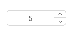
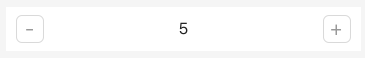
Screenshots
-
web:
-
react-native:
install

Usage
var InputNumber = require('rmc-input-number');
var React = require('react');
var ReactDOM = require('react-dom');
ReactDOM.render(<InputNumber defaultValue={19}/>, container);
Development
npm install
npm run watch-tsc
npm start
Example
http://127.0.0.1:8000/examples/
online example: http://react-component.github.io/m-input-number/examples/
react-native
npm run watch-tsc
npm run rn-init
react-native run-ios
API
props
| name | type | default | description |
|---|---|---|---|
| min | Number | Specifies the minimum value | |
| max | Number | Specifies the maximum value | |
| step | Number or String | 1 | Specifies the legal number intervals |
| precision | Number | Specifies the precision length of value | |
| disabled | Boolean | false | Specifies that an InputNumber should be disabled |
| focusOnUpDown | Boolean | true | whether focus input when click up or down button |
| autoFocus | Boolean | false | Specifies that an InputNumber should automatically get focus when the page loads |
| readOnly | Boolean | false | Specifies that an InputNumber is read only |
| value | Number | Specifies the value of an InputNumber | |
| defaultValue | Number | Specifies the defaultValue of an InputNumber | |
| onChange | Function | Called when value of an InputNumber changed | |
| style | Object | root style. such as {width:100} | |
| styles | ReactNative StyleSheet | component's stylesheet, can use lib/styles | |
| upStyle | Object | up step wrap style. `react native only` | |
| downStyle | Object | down step style. `react native only` | |
| inputStyle | Object | input style. `react native only` | |
| upHandler | React.Node | custom the up step element | |
| downHandler | React.Node | custom the down step element | |
| formatter | (value: number|string): displayValue: string | Specifies the format of the value presented | |
| parser | (displayValue: string) => value: number | `input => input.replace(/[^\w\.-]*/g, '')` | Specifies the value extracted from formatter |
Test Case
npm test
npm run chrome-test
Coverage
npm run coverage
open coverage/ dir
License
rmc-input-number is released under the MIT license.