You can not select more than 25 topics
Topics must start with a letter or number, can include dashes ('-') and can be up to 35 characters long.
 837816638@qq.com
b02b851162
837816638@qq.com
b02b851162
|
5 years ago | |
|---|---|---|
| .. | ||
| assets | 5 years ago | |
| es | 5 years ago | |
| lib | 5 years ago | |
| HISTORY.md | 5 years ago | |
| LICENSE | 5 years ago | |
| README.md | 5 years ago | |
| package.json | 5 years ago | |
README.md
rmc-tooltip
React Tooltip


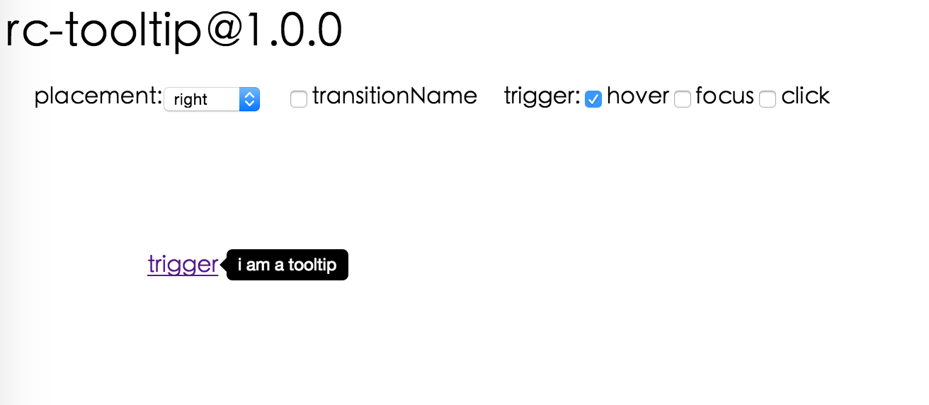
Screenshot
Install
Usage
var Tooltip = require('rmc-tooltip');
var React = require('react');
var ReactDOM = require('react-dom');

// By default, the tooltip has no style.
// Consider importing the stylesheet it comes with:
// 'rmc-tooltip/assets/bootstrap_white.css'

ReactDOM.render(<Tooltip placement="left" overlay={<span>tooltip</span>}><a href='#'>hover</a></Tooltip>, container);
Examples
npm start and then go to
http://localhost:8007/examples
Online examples: http://react-component.github.io/tooltip/examples/
API
Props
| name | type | default | description |
|---|---|---|---|
| overlayClassName | string | additional className added to popup overlay | |
| overlayStyle | Object | additional style of overlay node | |
| prefixCls | String | rmc-tooltip | prefix class name |
| transitionName | String | same as https://github.com/react-component/css-transition-group | |
| onVisibleChange | Function | call when visible is changed | |
| afterVisibleChange | Function | call after visible is changed | |
| visible | boolean | whether tooltip is visible | |
| defaultVisible | boolean | whether tooltip is visible initially | |
| placement | String | one of ['left','right','top','bottom', 'topLeft', 'topRight', 'bottomLeft', 'bottomRight'] | |
| align | Object: alignConfig of [dom-align](https://github.com/yiminghe/dom-align) | value will be merged into placement's config | |
| onPopupAlign | function(popupDomNode, align) | callback when popup node is aligned | |
| overlay | React.Element | () => React.Element | popup content | |
| arrowContent | React.Node | null | arrow content |
| getTooltipContainer | function | Function returning html node which will act as tooltip container. By default the tooltip attaches to the body. If you want to change the container, simply return a new element. | |
| destroyTooltipOnHide | boolean | false | whether destroy tooltip when tooltip is hidden |
Note
Tooltip requires child node accepts onClick event.
Development
npm install
npm start
Test Case
npm test
npm run chrome-test
Coverage
npm run coverage
License
rmc-tooltip is released under the MIT license.